Icon Buttons
Description
The Icon Button is a compact button containing only an icon, designed for actions where space is limited or the action is represented visually (e.g., close, search, favorite). It is available in multiple sizes, states, and types (primary, secondary, transparent).
Variants & states
Sizes
-
Large
-
Medium
-
Small
Types
-
Primary: Solid fill using brand color.
-
Secondary: Lighter variant for less prominent actions.
-
Transparent: No fill, only icon visible.
States
-
Default: Normal appearance.
-
Pressed: Darkened or active feedback.
-
Disabled: Reduced opacity, non-interactive.
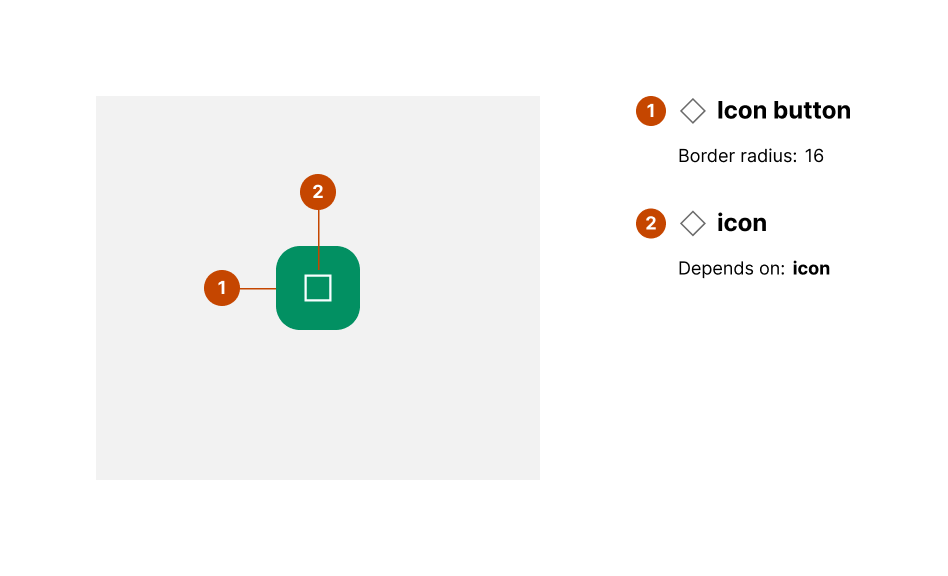
Anatomy
-
Icon button container:
-
Shape: Square
-
Background color (primary): #005E52
-
Border radius: 50% (circular)
-
-
Icon:
-
Depends on action (e.g., plus, close, favorite)
-
Center-aligned inside the container
-
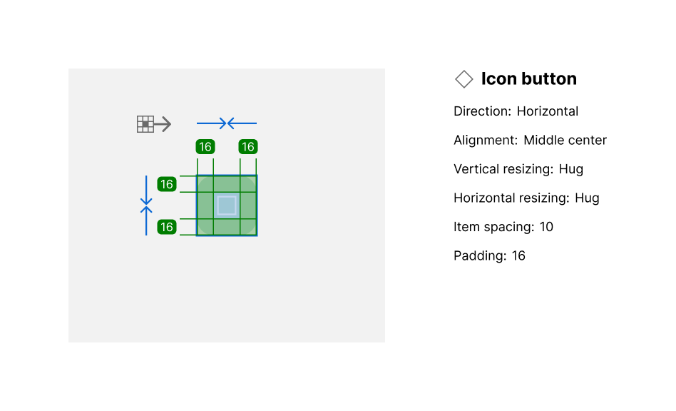
Layout and spacing
-
Direction: Vertical center alignment
-
Icon placement: Centered both horizontally and vertically
-
Padding: 16px internal padding for touch targets
-
Spacing: Minimum hit target 48x48px per accessibility standards
Usage guidelines
Do ✅
-
Use clear, recognizable icons to represent actions.
-
Ensure proper contrast between icon and background color.
-
Maintain consistent sizing across the interface.
Don’t ❌
-
Don’t use icon buttons without tooltips or labels where meaning isn’t obvious.
-
Avoid overcrowding layouts with too many icon buttons.
-
Don’t rely on color alone to indicate state (include shape or style changes).